
Sample Blog

Navigating the Fog: Why Founders Need Financial Health Dashboards
A financial health dashboard cuts through the uncertainty of early-stage startup finance, translating complex data into actionable insights. For a founder, the gap between your bank balance and your financial reality can feel like a dense fog. You know cash is the lifeblood of your startup, but relying on monthly accounting reports feels like driving by looking in the rearview mirror. A dashboard is your command center, providing the clarity to manage cash flow, forecast runway, and make confident decisions on the path to sustainable growth.
From Reactive Accounting to Proactive Decision-Making
Traditional accounting provides a crucial record of past performance, but these historical statements are often insufficient for a dynamic startup environment. The primary purpose of a financial dashboard is to shift your perspective from this reactive, historical view to a proactive, forward-looking one. It creates a living model of your business that highlights trends and informs your next move long before it would appear on a standard profit and loss statement.
At the heart of this proactive approach is cash management. For any pre-seed or seed-stage company, understanding daily and weekly cash movements is non-negotiable. A dashboard offers immediate value by providing an up-to-the-minute view of your cash position and net burn rate. Rather than waiting for a month-end surprise, you can see the impact of a new hire or a major customer payment on your reserves. For founders who are not finance professionals, building a real-time cash dashboard in Google Sheets is a powerful first step, providing an essential single source of truth for your most critical asset.
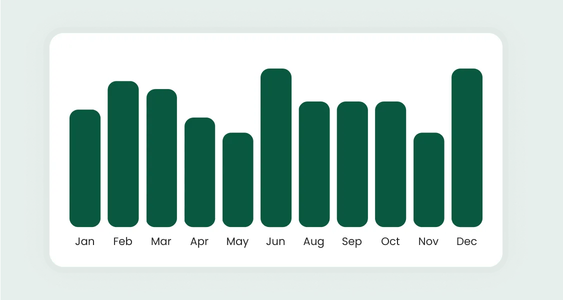
This real-time visibility translates directly into runway clarity. A static spreadsheet calculation of runway is notoriously unreliable, as it fails to account for seasonality or changes in momentum. A well-designed dashboard calculates runway dynamically, providing a more accurate forecast of how many months of operation you have left. This clarity is fundamental to building investor confidence. When you can clearly articulate your financial position and the key drivers behind your numbers, you demonstrate an operational rigor that sets you apart. The process of choosing and visualizing key metrics is central to telling this compelling, data-driven story.
Laying the Foundation: Your First Financial Health Dashboard
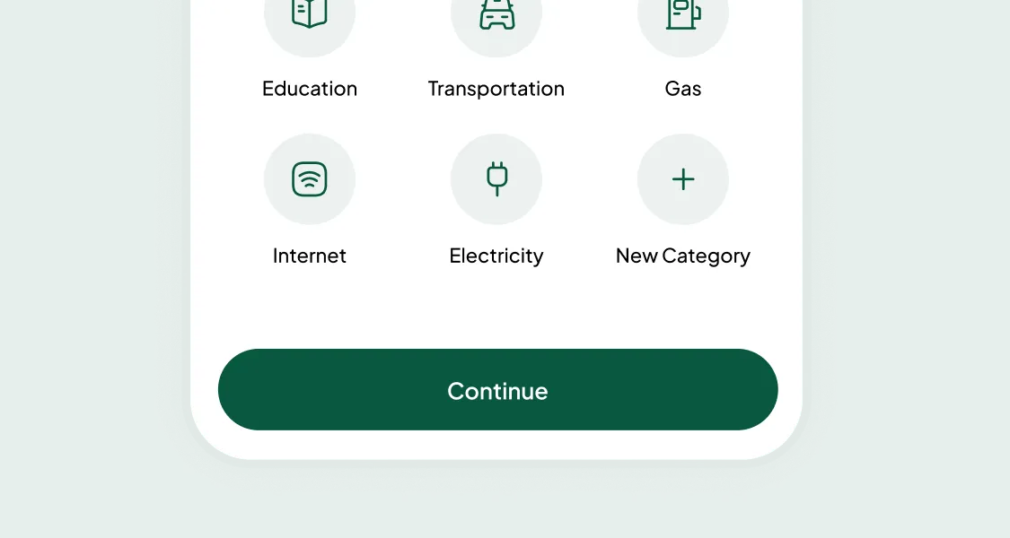
Building your first dashboard does not require a deep finance background. The goal is to start simple and focus on the most critical indicators of business health. For most early-stage startups, this means tracking a core set of metrics from your financial statements. These can be broken down into an essential quartet for survival:
- Revenue: Your top-line sales from the Profit & Loss (P&L) statement.
- Gross Margin: The profitability of what you sell, also from the P&L.
- Net Burn: The actual amount of cash your business is consuming each month, taken from the Cash Flow Statement.
- Runway: Your cash on hand from the Balance Sheet, divided by your net burn rate.
Together, these metrics provide a 360-degree view at a glance. Building your first financial health dashboard is a foundational exercise that establishes a baseline for performance and acts as your north star for day-to-day operational focus.
The audience for this initial dashboard is often you and your co-founders, so effective visualization is paramount. A cluttered dashboard can lead to misinterpretation and poor decisions. Following clear dashboard design principles for non-technical users, such as using simple charts and consistent color-coding, makes the information accessible. The goal is to enable anyone on your leadership team to grasp the financial health of the business in 60 seconds or less.
Once your baseline metrics are established, the next step is to add analytical depth. This is where you can perform variance analysis directly within your dashboard. By plotting your actual performance against your budget or forecast, you can instantly see where you are over-performing or falling short. Spotting these variances early allows you to investigate the root cause and take corrective action, transforming the dashboard from a reporting tool into an active monitoring system.
Choosing Your Tools: From Spreadsheets to Business Intelligence
The right technology for your financial dashboard depends on your company's stage, complexity, and budget. For many pre-seed startups, a well-structured spreadsheet is the perfect starting point. It is flexible and free, but its primary drawback is the risk of manual error.
The next logical step is to leverage free Business Intelligence (BI) platforms. For founders in the Google ecosystem, exploring how to build free financial dashboards with Looker Studio is an excellent choice. Looker Studio (formerly Google Data Studio) can connect to Google Sheets and other sources to create interactive dashboards that automatically refresh. This represents the ideal middle ground for early-stage companies needing more power than a spreadsheet but not yet ready for enterprise software.
As your startup scales past Series A, the complexity of your data may outgrow these entry-level solutions. With multiple revenue streams or large datasets, you may require more robust BI tools like Tableau or Power BI. For growth-stage companies, creating Tableau financial dashboards for startups allows for deep-dive analysis. Similarly, for companies in the Microsoft ecosystem, leveraging Power BI for startup financial reporting provides seamless integration with other tools.
Regardless of the visualization tool you choose, its effectiveness depends on the quality of the underlying data. The most critical integration is with your accounting system. When you align dashboard metrics with formal financial statements, follow the IFRS Foundation's Conceptual Framework to ensure consistency with recognized accounting principles. For businesses in the US, connecting QuickBooks to dashboard tools is a common requirement. For those in the UK and other regions, setting up a Xero dashboard integration achieves the same goal. These integrations ensure that every transaction is automatically fed into your dashboard, providing a truly live picture of your company's health.
Tailoring Your View: Advanced and Industry-Specific Dashboards
Once you have a foundational dashboard, the next stage is to build views tailored to your specific business model. Generic metrics provide a health check, but industry-specific KPIs provide a competitive edge. The metrics that matter for a SaaS company are different from those for an e-commerce or biotech firm.
For subscription businesses, a comprehensive SaaS metrics dashboard is indispensable. This moves beyond simple P&L metrics to track Monthly Recurring Revenue (MRR), customer churn, and efficiency ratios like LTV-to-CAC. E-commerce businesses, on the other hand, depend on product margins and inventory management. A dashboard focused on e-commerce financial health must track metrics like Cost of Goods Sold (COGS) and inventory turnover days.
The challenges for R&D-heavy companies like biotech are different again. Often pre-revenue for years, their financial story is about capital efficiency. A biotech R&D burn dashboard is designed to correlate cash burn with scientific progress. This is an area where geographical differences in accounting are significant. If your company is UK-based or is claiming UK R&D support, consult HMRC's guidance on what Research and Development costs you can claim to make sure your dashboard reflects tax‑eligible spend accurately. For US companies, factor the IRS Section 174 rules on amortization of research and experimental expenditures into your R&D burn modeling and tax timing assumptions.
Other business models have unique drivers. A professional services utilization dashboard focuses on project profitability and billable hours. Many startups also benefit from advanced analytical views. Cohort analysis dashboards for subscription businesses can reveal crucial retention trends, while a unit economics dashboard is essential to prove your business model can be profitable at scale. Digging into your specific unit economics and metrics is often the most important step in preparing for a fundraising round.
From Hindsight to Foresight: Using Dashboards for Strategy
The ultimate goal of a financial health dashboard is to evolve it from a tool for reporting the past into a system for shaping the future. This leap occurs when you use metrics for forecasting, planning, and empowering your entire team. A mature dashboard becomes a central nervous system for the business, facilitating smarter and more aligned decisions.
A key step is decentralizing financial awareness. When financial data is siloed, budget owners are flying blind. By creating department-level financial dashboards, you empower leaders to take ownership of their own performance. Giving a head of marketing a real-time view of their budget versus actual spend fosters a culture of accountability and financial discipline throughout the organization.
With a firm grasp of your data, you can begin to model potential futures. Interactive scenario planning dashboards allow you to model best-case, base-case, and worst-case outcomes for key variables like revenue growth or customer churn. What happens to our runway if we miss our sales target for two consecutive quarters? Answering these questions with data-driven models replaces anxiety with a concrete action plan for any eventuality.
Finally, you can consolidate this intelligence into a single, high-level indicator. Many mature companies develop a custom financial health score framework. This involves selecting your most critical KPIs, weighting them based on strategic goals, and combining them into a single score. This provides an unambiguous, at-a-glance summary of whether the business is moving in the right direction, serving as the ultimate single source of truth for board meetings and investor updates.
Your Command Center for Growth
The journey from a simple bank balance check to a sophisticated financial dashboard is a journey toward operational excellence. It begins by tackling the most immediate founder anxiety: cash and runway. By building a simple, real-time view of your core financial metrics, you replace gut-feel decisions with data-driven clarity. You establish a single source of truth that aligns your team and builds investor confidence.
As your business grows, so too will your dashboards. You will move from foundational metrics to industry-specific KPIs that track the true drivers of your business model. You will graduate from simple spreadsheets to more powerful BI tools, automating your data pipelines to free up valuable time for analysis. The dashboard ceases to be a static report and becomes an interactive, analytical workspace.
Ultimately, this system transforms from a tool for looking backward into a command center for navigating the future. By enabling department-level ownership and stress-testing decisions with scenario planning, you embed a data-driven strategy into your company’s culture. A financial health dashboard is more than just a collection of charts; it is the manifestation of your company’s financial intelligence and one of the most powerful tools you have to build a resilient, high-growth business.
"Read Our Next Article


Curious How We Support Startups Like Yours?
